diff-diff Plotting Functions: Current State & Improvement Roadmap

Goal: Explore the existing plotting capabilities of diff-diff and identify gaps relative to R’s ggfixest. The end goal is to contribute Python plotting functions that are as polished and flexible as ggfixest.


Table of Contents

  1. Setup & Data
  2. Existing diff-diff Plot Functions
  3. What ggfixest Does Better
  4. Gap Analysis
  5. Prototyping Improvements

1. Setup & Data

import numpy as np
import pandas as pd
import matplotlib.pyplot as plt
import matplotlib.ticker as mticker

from diff_diff import (
    DifferenceInDifferences,
    TwoWayFixedEffects,
    MultiPeriodDiD,
    CallawaySantAnna,
    SyntheticDiD,
    ImputationDiD,
    SunAbraham,
    generate_did_data,
    load_mpdta,
    plot_event_study,
    plot_group_effects,
)

import warnings
warnings.filterwarnings('ignore')

print('diff-diff imported successfully')
c:\Users\danny\anaconda3\Lib\site-packages\pandas\core\computation\expressions.py:22: UserWarning: Pandas requires version '2.10.2' or newer of 'numexpr' (version '2.8.7' currently installed).
  from pandas.core.computation.check import NUMEXPR_INSTALLED
c:\Users\danny\anaconda3\Lib\site-packages\pandas\core\arrays\masked.py:56: UserWarning: Pandas requires version '1.4.2' or newer of 'bottleneck' (version '1.3.7' currently installed).
  from pandas.core import (
diff-diff imported successfully

1.1. Generate Panel Data

We use diff-diff’s built-in data generators plus the mpdta staggered adoption dataset.
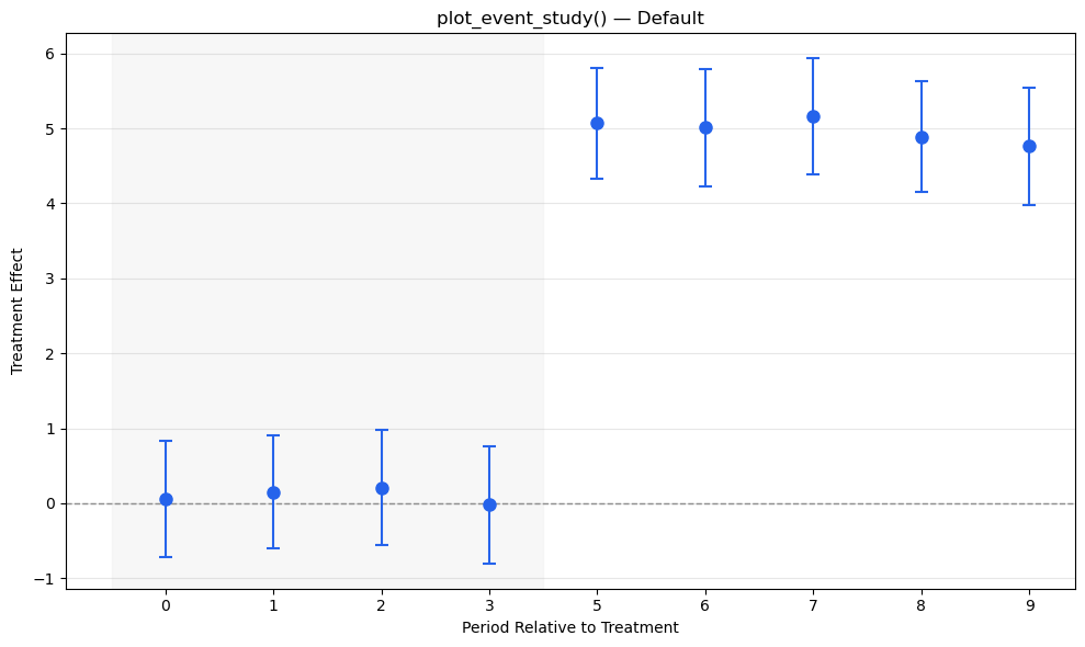
# Simple pre/post DiD data
data_simple = generate_did_data(
    n_units=200, n_periods=10, treatment_effect=5.0,
    treatment_fraction=0.5, treatment_period=5, seed=42
)
print(f"Simple DiD data: {data_simple.shape}")
print(data_simple.head())
Simple DiD data: (2000, 6)
   unit  period  treated  post    outcome  true_effect
0     0       0        1     0  10.947009          0.0
1     0       1        1     0  12.516916          0.0
2     0       2        1     0  11.700019          0.0
3     0       3        1     0  12.753373          0.0
4     0       4        1     0  10.559262          0.0
# Staggered adoption data (mpdta - for Callaway-Sant'Anna demos)
try:
    mpdta = load_mpdta()
    print(f"MPDTA data: {mpdta.shape}")
    print(mpdta.head())
    print(f"\nTreatment cohorts: {sorted(mpdta['first_treat'].unique())}")
except Exception as e:
    print(f"Could not load mpdta: {e}")
    # Fallback: generate staggered data manually
    rng = np.random.default_rng(42)
    units = []
    for i in range(50):
        cohort = rng.choice([0, 5, 7, 9])  # 0 = never treated
        for t in range(1, 11):
            treated = 1 if cohort > 0 and t >= cohort else 0
            y = 2 + 0.3 * t + rng.uniform(0, 3) + treated * 3.0 + rng.normal(0, 1)
            units.append({'unit': i, 'period': t, 'y': y, 'first_treat': cohort if cohort > 0 else np.inf})
    mpdta = pd.DataFrame(units)
    print(f"Generated staggered data: {mpdta.shape}")
MPDTA data: (2500, 7)
   countyreal  year     lpop    lemp  first_treat  treat  cohort
0           1  2003  11.3683  9.5457         2006      1    2006
1           1  2004  11.3119  9.5772         2006      1    2006
2           1  2005  11.3795  9.5767         2006      1    2006
3           1  2006  11.3683  9.5670         2006      1    2006
4           1  2007  11.3053  9.6027         2006      1    2006

Treatment cohorts: [0, 2004, 2006, 2007]

2. Existing diff-diff Plot Functions

Let’s test each plotting function that diff-diff provides.

2.1. plot_event_study()

The main event study visualization. Works with MultiPeriodDiD, CallawaySantAnna, SunAbraham, ImputationDiD results, or raw DataFrames.

# Multi-period DiD event study
mp_did = MultiPeriodDiD(alpha=0.05)
mp_results = mp_did.fit(
    data_simple,
    outcome='outcome',
    treatment='treated',
    time='period',
    post_periods=list(range(5, 10)),
)
print("MultiPeriodDiD results:")
print(f"  avg ATT: {mp_results.avg_att:.3f}")
print(f"  avg SE:  {mp_results.avg_se:.3f}")
print(f"  Period effects: {mp_results.period_effects}")
MultiPeriodDiD results:
  avg ATT: 4.977
  avg SE:  0.292
  Period effects: {0: PeriodEffect(period=0, effect=0.0532, SE=0.3949, p=0.8929), 1: PeriodEffect(period=1, effect=0.1473, SE=0.3855, p=0.7025), 2: PeriodEffect(period=2, effect=0.2097, SE=0.3903, p=0.5911), 3: PeriodEffect(period=3, effect=-0.0177, SE=0.3999, p=0.9647), 5: PeriodEffect(period=5, effect=5.0691***, SE=0.3787, p=0.0000), 6: PeriodEffect(period=6, effect=5.0104***, SE=0.3990, p=0.0000), 7: PeriodEffect(period=7, effect=5.1575***, SE=0.3952, p=0.0000), 8: PeriodEffect(period=8, effect=4.8875***, SE=0.3774, p=0.0000), 9: PeriodEffect(period=9, effect=4.7609***, SE=0.3976, p=0.0000)}
# Default plot_event_study
plot_event_study(mp_results, title='plot_event_study() — Default')

# Customized plot_event_study
plot_event_study(
    mp_results,
    title='plot_event_study() — Customized',
    color='#440154',
    marker='s',
    markersize=10,
    linewidth=2,
    figsize=(12, 6),
    shade_color='#e8e0f0',
)

2.2. plot_event_study() with Callaway-Sant’Anna

The same function also works with staggered DiD estimators.

# Callaway-Sant'Anna
try:
    cs = CallawaySantAnna(control_group='never_treated', alpha=0.05)
    cs_results = cs.fit(
        mpdta,
        outcome='lemp' if 'lemp' in mpdta.columns else 'y',
        unit='countyreal' if 'countyreal' in mpdta.columns else 'unit',
        time='year' if 'year' in mpdta.columns else 'period',
        first_treat='first_treat',
        aggregate='event_study',
    )
    print(f"CS Overall ATT: {cs_results.overall_att:.4f}")
    print(f"Event study effects: {cs_results.event_study_effects[:3]}...")
    plot_event_study(cs_results, title='Callaway-Sant\'Anna Event Study')
except Exception as e:
    print(f"CS estimation failed: {e}")
CS Overall ATT: -0.0214
CS estimation failed: unhashable type: 'slice'

2.3. plot_group_effects()

Shows treatment effects separately by cohort (group). Only works with CallawaySantAnnaResults.

try:
    plot_group_effects(cs_results, title='Treatment Effects by Cohort')
except Exception as e:
    print(f"plot_group_effects failed: {e}")

2.4. plot_event_study() with Manual Data

Can also pass a plain DataFrame or dictionaries directly.

# Manual event study data
es_df = pd.DataFrame({
    'period': [-4, -3, -2, -1, 0, 1, 2, 3, 4],
    'effect': [0.2, -0.1, 0.05, 0.0, 0.0, 2.5, 3.1, 3.8, 4.2],
    'se':     [0.3,  0.25, 0.2, 0.15, 0.0, 0.4, 0.45, 0.5, 0.55],
})

plot_event_study(
    es_df,
    reference_period=0,
    title='Manual Event Study Data',
)

3. What ggfixest Does Better

R’s ggfixest by Grant McDermott provides several features that diff-diff currently lacks. Here’s a comparison:

3.1. ggfixest Key Functions

ggfixest diff-diff Equivalent Status
ggiplot() plot_event_study() Partial — missing ribbon, multi-CI, aggregate effects
ggcoefplot() None Missing — no general coefficient plot
aggr_es() None Missing — no aggregation + overlay utility
iplot_data() None Missing — no tidy data extraction layer
coefplot_data() None Missing — no tidy data extraction layer

3.2. Feature Gap Analysis

Feature ggfixest diff-diff Priority
Ribbon/shaded CIs geom_style='ribbon' Not available HIGH
Multiple CI levels ci_level=c(.8, .95) Not available HIGH
Multi-model comparison dodge or facet Not available HIGH
Aggregate effects overlay aggr_eff='post' Not available MEDIUM
Tidy data extraction iplot_data() Not available HIGH
ggplot2-like composability Full + chaining Raw matplotlib MEDIUM
Dictionary relabeling dict parameter Not available LOW
Reference period styling Hollow marker + line Hollow marker only LOW
Coefficient grouping group parameter Not available LOW

4. Gap Analysis: Side-by-Side Examples

Let’s visualize what’s currently possible vs. what we want to achieve.

4.1. Gap: Ribbon CIs (Shaded Confidence Bands)

ggfixest offers geom_style = 'ribbon' for smooth shaded confidence bands. diff-diff only supports point + errorbar.

# What diff-diff currently produces (errorbar only)
fig, axes = plt.subplots(1, 2, figsize=(14, 5))

# Current: errorbar style
periods = es_df['period'].values
effects = es_df['effect'].values
se = es_df['se'].values
ci_low = effects - 1.96 * se
ci_high = effects + 1.96 * se

ax = axes[0]
ax.errorbar(periods, effects, yerr=1.96*se, fmt='o-', color='#2563eb',
            capsize=4, markersize=8, linewidth=1.5)
ax.axhline(0, color='gray', linestyle='--', linewidth=1)
ax.axvline(-0.5, color='gray', linestyle=':', linewidth=1, alpha=0.5)
ax.set_title('Current: Errorbar Style', fontsize=13)
ax.set_xlabel('Period Relative to Treatment')
ax.set_ylabel('Treatment Effect')
ax.grid(True, alpha=0.2)

# Target: ribbon style (like ggfixest)
ax = axes[1]
ax.plot(periods, effects, 'o-', color='#2563eb', markersize=8, linewidth=2, zorder=3)
ax.fill_between(periods, ci_low, ci_high, alpha=0.2, color='#2563eb', label='95% CI')
ax.axhline(0, color='gray', linestyle='--', linewidth=1)
ax.axvline(-0.5, color='gray', linestyle=':', linewidth=1, alpha=0.5)
ax.set_title('Target: Ribbon Style (like ggfixest)', fontsize=13)
ax.set_xlabel('Period Relative to Treatment')
ax.set_ylabel('Treatment Effect')
ax.legend(fontsize=10)
ax.grid(True, alpha=0.2)

plt.tight_layout()
plt.show()

4.2. Gap: Multiple CI Levels

ggfixest can show nested CIs (e.g., 80% inner + 95% outer). diff-diff only supports a single level.

fig, axes = plt.subplots(1, 2, figsize=(14, 5))

# Current: single CI level
ax = axes[0]
ax.errorbar(periods, effects, yerr=1.96*se, fmt='o-', color='#2563eb',
            capsize=4, markersize=8, linewidth=1.5)
ax.axhline(0, color='gray', linestyle='--', linewidth=1)
ax.set_title('Current: Single CI (95%)', fontsize=13)
ax.set_xlabel('Period Relative to Treatment')
ax.set_ylabel('Treatment Effect')
ax.grid(True, alpha=0.2)

# Target: nested CIs (80% + 95%)
ax = axes[1]
ci80_low = effects - 1.28 * se
ci80_high = effects + 1.28 * se
ci95_low = effects - 1.96 * se
ci95_high = effects + 1.96 * se

ax.fill_between(periods, ci95_low, ci95_high, alpha=0.15, color='#2563eb', label='95% CI')
ax.fill_between(periods, ci80_low, ci80_high, alpha=0.3, color='#2563eb', label='80% CI')
ax.plot(periods, effects, 'o-', color='#2563eb', markersize=8, linewidth=2, zorder=3)
ax.axhline(0, color='gray', linestyle='--', linewidth=1)
ax.set_title('Target: Nested CIs (80% + 95%)', fontsize=13)
ax.set_xlabel('Period Relative to Treatment')
ax.set_ylabel('Treatment Effect')
ax.legend(fontsize=10)
ax.grid(True, alpha=0.2)

plt.tight_layout()
plt.show()

4.3. Gap: Multi-Model Comparison (Dodge & Facet)

ggfixest can plot multiple estimators side-by-side (multi_style='dodge') or in facets. This is critical for comparing TWFE vs. robust estimators.

# Simulate results from 3 estimators
np.random.seed(42)
periods_rel = np.arange(-4, 5)
true_effect = np.where(periods_rel >= 0, 3.0 + 0.5 * periods_rel, 0)

models = {
    'TWFE':              true_effect + np.random.normal(0, 0.3, len(periods_rel)),
    'Callaway-Sant\'Anna': true_effect + np.random.normal(0, 0.25, len(periods_rel)),
    'Sun-Abraham':       true_effect + np.random.normal(0, 0.35, len(periods_rel)),
}
model_se = {k: np.abs(np.random.normal(0.4, 0.1, len(periods_rel))) for k in models}

# --- Dodge style ---
fig, axes = plt.subplots(1, 2, figsize=(16, 5.5))

ax = axes[0]
colors = ['#440154', '#35b779', '#fde725']
n_models = len(models)
width = 0.25

for j, (name, eff) in enumerate(models.items()):
    offset = (j - (n_models - 1) / 2) * width
    se_vals = model_se[name]
    ax.errorbar(periods_rel + offset, eff, yerr=1.96*se_vals,
                fmt='o', color=colors[j], capsize=3, markersize=6,
                linewidth=1.2, label=name)

ax.axhline(0, color='gray', linestyle='--', linewidth=1)
ax.axvline(-0.5, color='gray', linestyle=':', linewidth=1, alpha=0.5)
ax.set_title('Target: Multi-Model Dodge', fontsize=13)
ax.set_xlabel('Period Relative to Treatment')
ax.set_ylabel('Treatment Effect')
ax.legend(fontsize=9)
ax.grid(True, alpha=0.2)

# --- Facet style ---
ax = axes[1]
# Create a mini 1x3 facet within the right panel
axes[1].remove()
gs = fig.add_gridspec(1, 3, left=0.55, right=0.98, wspace=0.3, bottom=0.12, top=0.88)

for j, (name, eff) in enumerate(models.items()):
    ax_f = fig.add_subplot(gs[0, j])
    se_vals = model_se[name]
    ax_f.fill_between(periods_rel, eff - 1.96*se_vals, eff + 1.96*se_vals,
                      alpha=0.2, color=colors[j])
    ax_f.plot(periods_rel, eff, 'o-', color=colors[j], markersize=5, linewidth=1.5)
    ax_f.axhline(0, color='gray', linestyle='--', linewidth=0.8)
    ax_f.axvline(-0.5, color='gray', linestyle=':', linewidth=0.8, alpha=0.5)
    ax_f.set_title(name, fontsize=10)
    if j == 0:
        ax_f.set_ylabel('Effect', fontsize=9)
    ax_f.set_xlabel('Period', fontsize=9)
    ax_f.tick_params(labelsize=8)
    ax_f.grid(True, alpha=0.2)

fig.suptitle('Multi-Model Comparison: Dodge vs Facet', fontsize=14, y=0.98)
plt.show()

4.4. Gap: Aggregate Effects Overlay

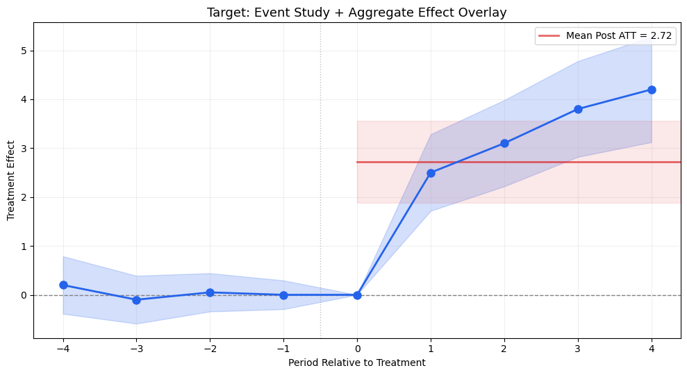
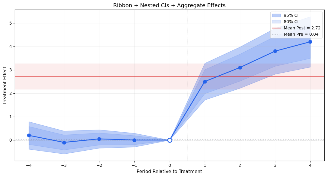
ggfixest’s aggr_eff = 'post' adds a shaded rectangle showing the mean post-treatment effect. Very useful for summarizing the overall ATT alongside the event study.

fig, ax = plt.subplots(figsize=(10, 5.5))

effects_sim = np.array([0.2, -0.1, 0.05, 0.0, 0.0, 2.5, 3.1, 3.8, 4.2])
se_sim = np.array([0.3, 0.25, 0.2, 0.15, 0.0, 0.4, 0.45, 0.5, 0.55])

# Event study
ax.fill_between(periods, effects_sim - 1.96*se_sim, effects_sim + 1.96*se_sim,
                alpha=0.2, color='#2563eb')
ax.plot(periods, effects_sim, 'o-', color='#2563eb', markersize=8, linewidth=2, zorder=3)

# Aggregate post-treatment effect (mean of post periods)
post_mask = periods >= 0
post_mean = effects_sim[post_mask].mean()
post_se = np.sqrt(np.mean(se_sim[post_mask]**2))  # simplified

ax.axhspan(post_mean - 1.96*post_se, post_mean + 1.96*post_se,
           xmin=0.5, xmax=1.0, alpha=0.1, color='#dc2626')
ax.axhline(post_mean, xmin=0.5, color='#dc2626', linestyle='-', linewidth=2,
           alpha=0.7, label=f'Mean Post ATT = {post_mean:.2f}')

ax.axhline(0, color='gray', linestyle='--', linewidth=1)
ax.axvline(-0.5, color='gray', linestyle=':', linewidth=1, alpha=0.5)
ax.set_title('Target: Event Study + Aggregate Effect Overlay', fontsize=13)
ax.set_xlabel('Period Relative to Treatment')
ax.set_ylabel('Treatment Effect')
ax.legend(fontsize=10)
ax.grid(True, alpha=0.2)

plt.tight_layout()
plt.show()

5. Prototyping Improvements

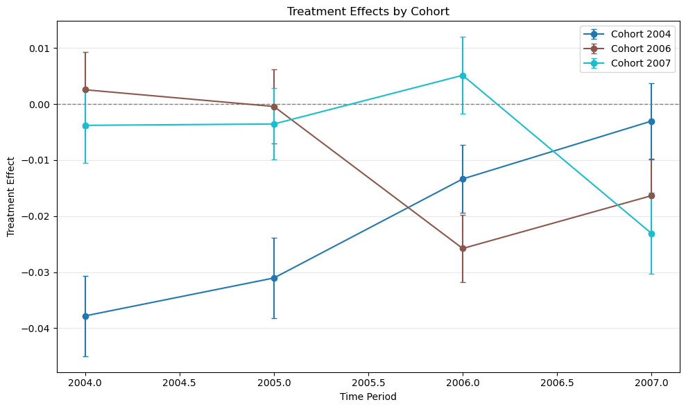
Below we prototype the key missing features as standalone functions. These could be contributed to diff-diff.

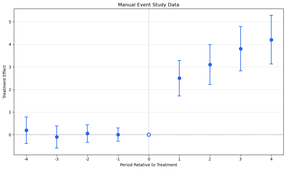
5.1. iplot_data() — Tidy Data Extraction

The foundation layer. Extracts a standardized DataFrame from any diff-diff result object, ready for custom plotting. This mirrors ggfixest’s iplot_data().

from scipy import stats as scipy_stats

def iplot_data(results, ci_level=0.95, reference_period=None):
    """
    Extract tidy event study data from diff-diff results.
    
    Returns a DataFrame with columns:
      period, estimate, se, ci_low, ci_high, ci_level, is_ref
    """
    z = scipy_stats.norm.ppf(1 - (1 - ci_level) / 2)
    
    # Handle DataFrame input
    if isinstance(results, pd.DataFrame):
        df = results.copy()
        if 'period' not in df.columns:
            raise ValueError("DataFrame must have 'period' column")
        if 'effect' in df.columns:
            df = df.rename(columns={'effect': 'estimate'})
        df['ci_low'] = df['estimate'] - z * df['se']
        df['ci_high'] = df['estimate'] + z * df['se']
        df['ci_level'] = ci_level
        df['is_ref'] = df['period'] == reference_period if reference_period is not None else False
        return df[['period', 'estimate', 'se', 'ci_low', 'ci_high', 'ci_level', 'is_ref']]
    
    # Handle dict input
    if isinstance(results, dict) and 'effects' in results:
        periods = sorted(results['effects'].keys())
        rows = []
        for p in periods:
            est = results['effects'][p]
            se_val = results.get('se', {}).get(p, 0)
            rows.append({
                'period': p, 'estimate': est, 'se': se_val,
                'ci_low': est - z * se_val, 'ci_high': est + z * se_val,
                'ci_level': ci_level,
                'is_ref': p == reference_period if reference_period is not None else False,
            })
        return pd.DataFrame(rows)
    
    # Handle diff-diff result objects
    # Try extracting event_study_effects (CallawaySantAnna, etc.)
    if hasattr(results, 'event_study_effects'):
        es = results.event_study_effects
        rows = []
        for entry in es:
            p = entry.get('event_time', entry.get('period', 0))
            est = entry.get('att', entry.get('estimate', 0))
            se_val = entry.get('se', 0)
            rows.append({
                'period': p, 'estimate': est, 'se': se_val,
                'ci_low': est - z * se_val, 'ci_high': est + z * se_val,
                'ci_level': ci_level,
                'is_ref': p == reference_period if reference_period is not None else False,
            })
        return pd.DataFrame(rows).sort_values('period').reset_index(drop=True)
    
    raise TypeError(f"Unsupported result type: {type(results)}")


# Demo
tidy = iplot_data(es_df, ci_level=0.95, reference_period=0)
print("Tidy event study data:")
tidy
Tidy event study data:
period estimate se ci_low ci_high ci_level is_ref
0 -4 0.20 0.30 -0.387989 0.787989 0.95 False
1 -3 -0.10 0.25 -0.589991 0.389991 0.95 False
2 -2 0.05 0.20 -0.341993 0.441993 0.95 False
3 -1 0.00 0.15 -0.293995 0.293995 0.95 False
4 0 0.00 0.00 0.000000 0.000000 0.95 True
5 1 2.50 0.40 1.716014 3.283986 0.95 False
6 2 3.10 0.45 2.218016 3.981984 0.95 False
7 3 3.80 0.50 2.820018 4.779982 0.95 False
8 4 4.20 0.55 3.122020 5.277980 0.95 False

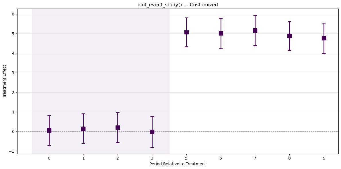
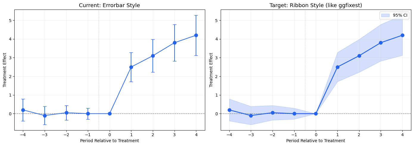
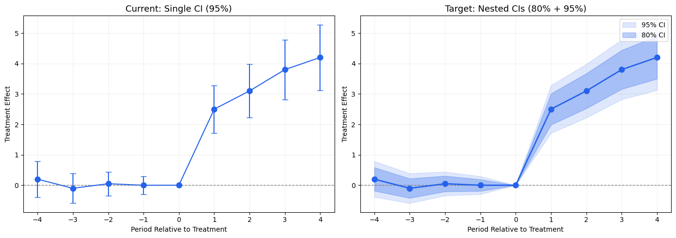
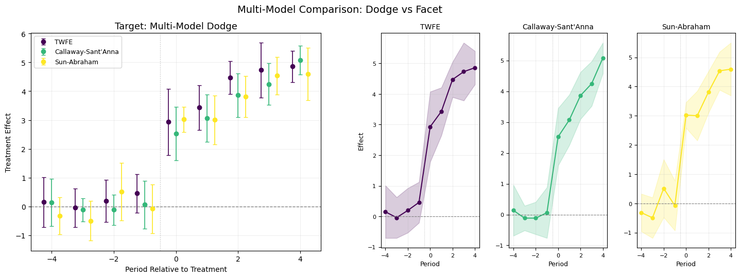
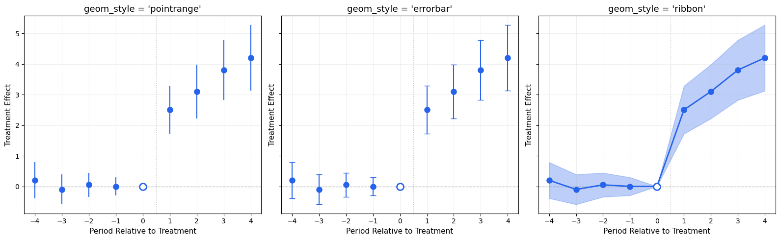
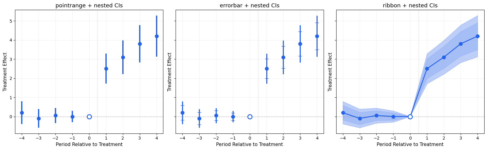
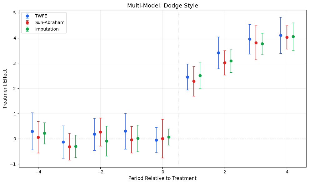
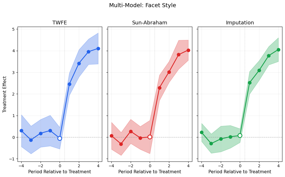
5.2. ggiplot() — Enhanced Event Study Plot

The main function, inspired by ggfixest::ggiplot(). Supports ribbon CIs, multiple CI levels, multi-model comparison, and aggregate effects overlay.

def ggiplot(
    results,
    *,
    geom_style='pointrange',     # 'pointrange', 'errorbar', 'ribbon'
    ci_level=0.95,               # float or list of floats for nested CIs
    reference_period=None,
    aggr_eff=None,               # 'post', 'pre', 'both'
    # Multi-model: pass dict {name: results}
    multi_style='dodge',         # 'dodge' or 'facet'
    # Aesthetics
    colors=None,
    figsize=(10, 6),
    title='Event Study',
    xlabel='Period Relative to Treatment',
    ylabel='Treatment Effect',
    show_zero=True,
    show_ref_line=True,
    shade_pre=False,
    ax=None,
    show=True,
):
    """
    Enhanced event study plot inspired by ggfixest::ggiplot().
    
    Parameters
    ----------
    results : DataFrame, dict of DataFrames, or diff-diff result object
        If dict, keys are model names and values are result objects (multi-model).
    geom_style : str
        'pointrange' (default), 'errorbar', or 'ribbon'
    ci_level : float or list of float
        Confidence level(s). Pass [0.80, 0.95] for nested CIs.
    aggr_eff : str or None
        'post' to overlay mean post-treatment effect, 'pre' for pre, 'both' for both.
    multi_style : str
        'dodge' (side-by-side) or 'facet' (separate panels).
    """
    default_colors = ['#2563eb', '#dc2626', '#16a34a', '#ea580c', '#8b5cf6']
    if colors is None:
        colors = default_colors
    
    # Normalize ci_level to list
    if isinstance(ci_level, (int, float)):
        ci_levels = [ci_level]
    else:
        ci_levels = sorted(ci_level, reverse=True)  # widest first
    
    # Handle multi-model dict input
    is_multi = isinstance(results, dict) and not ('effects' in results)
    
    if is_multi and multi_style == 'facet':
        n_models = len(results)
        fig, axes_arr = plt.subplots(1, n_models, figsize=(figsize[0], figsize[1]), sharey=True)
        if n_models == 1:
            axes_arr = [axes_arr]
        
        for idx, (name, res) in enumerate(results.items()):
            ggiplot(
                res, geom_style=geom_style, ci_level=ci_level,
                reference_period=reference_period, aggr_eff=aggr_eff,
                colors=[colors[idx % len(colors)]],
                title=name, xlabel=xlabel,
                ylabel=ylabel if idx == 0 else '',
                show_zero=show_zero, show_ref_line=show_ref_line,
                ax=axes_arr[idx], show=False,
            )
        
        fig.suptitle(title, fontsize=14, y=1.02)
        plt.tight_layout()
        if show:
            plt.show()
        return axes_arr
    
    # Single model or dodge
    if ax is None:
        fig, ax = plt.subplots(figsize=figsize)
    
    if is_multi:
        # Dodge: plot all models on same axis with offset
        model_names = list(results.keys())
        n_models = len(model_names)
        dodge_width = 0.2
        
        for idx, (name, res) in enumerate(results.items()):
            tidy = iplot_data(res, ci_level=ci_levels[-1], reference_period=reference_period)
            offset = (idx - (n_models - 1) / 2) * dodge_width
            color = colors[idx % len(colors)]
            x = tidy['period'].values + offset
            
            if geom_style == 'ribbon':
                for cl in ci_levels:
                    td = iplot_data(res, ci_level=cl, reference_period=reference_period)
                    alpha_fill = 0.15 + 0.15 * (1 - ci_levels.index(cl) / max(1, len(ci_levels) - 1))
                    ax.fill_between(td['period'].values + offset,
                                    td['ci_low'], td['ci_high'],
                                    alpha=alpha_fill, color=color)
                ax.plot(x, tidy['estimate'], 'o-', color=color, markersize=6,
                        linewidth=1.5, label=name, zorder=3)
            elif geom_style == 'errorbar':
                ax.errorbar(x, tidy['estimate'],
                            yerr=[tidy['estimate'] - tidy['ci_low'],
                                  tidy['ci_high'] - tidy['estimate']],
                            fmt='o', color=color, capsize=3, markersize=6,
                            linewidth=1.2, label=name)
            else:  # pointrange
                ax.errorbar(x, tidy['estimate'],
                            yerr=[tidy['estimate'] - tidy['ci_low'],
                                  tidy['ci_high'] - tidy['estimate']],
                            fmt='o', color=color, capsize=0, markersize=6,
                            linewidth=2, label=name)
        
        ax.legend(fontsize=10)
    
    else:
        # Single model
        color = colors[0]
        
        # Get tidy data for the widest CI level
        tidy = iplot_data(results, ci_level=ci_levels[-1], reference_period=reference_period)
        x = tidy['period'].values
        
        if geom_style == 'ribbon':
            for cl in ci_levels:
                td = iplot_data(results, ci_level=cl, reference_period=reference_period)
                alpha_fill = 0.15 + 0.15 * (1 - ci_levels.index(cl) / max(1, len(ci_levels) - 1))
                label = f'{cl:.0%} CI' if len(ci_levels) > 1 else f'{cl:.0%} CI'
                ax.fill_between(x, td['ci_low'], td['ci_high'],
                                alpha=alpha_fill, color=color, label=label)
            ax.plot(x, tidy['estimate'], 'o-', color=color, markersize=8,
                    linewidth=2, zorder=3)
        
        elif geom_style == 'errorbar':
            for cl in ci_levels:
                td = iplot_data(results, ci_level=cl, reference_period=reference_period)
                lw = 1.5 if cl == ci_levels[-1] else 2.5
                cs = 4 if cl == ci_levels[-1] else 0
                label = f'{cl:.0%} CI'
                ax.errorbar(x, td['estimate'],
                            yerr=[td['estimate'] - td['ci_low'],
                                  td['ci_high'] - td['estimate']],
                            fmt='o' if cl == ci_levels[-1] else 'none',
                            color=color, capsize=cs, markersize=8,
                            linewidth=lw, label=label, zorder=2 + ci_levels.index(cl))
        
        else:  # pointrange
            for cl in ci_levels:
                td = iplot_data(results, ci_level=cl, reference_period=reference_period)
                lw = 1.5 if cl == ci_levels[-1] else 3
                ax.errorbar(x, td['estimate'],
                            yerr=[td['estimate'] - td['ci_low'],
                                  td['ci_high'] - td['estimate']],
                            fmt='o' if cl == ci_levels[-1] else 'none',
                            color=color, capsize=0, markersize=8,
                            linewidth=lw, zorder=2 + ci_levels.index(cl))
        
        # Reference period marker
        if reference_period is not None:
            ref_row = tidy[tidy['period'] == reference_period]
            if len(ref_row) > 0:
                ax.plot(reference_period, ref_row['estimate'].values[0],
                        'o', color='white', markersize=10, markeredgecolor=color,
                        markeredgewidth=2, zorder=5)
    
    # Aggregate effect overlay
    if aggr_eff is not None:
        tidy_agg = iplot_data(results, ci_level=ci_levels[-1], reference_period=reference_period)
        
        if aggr_eff in ('post', 'both'):
            post = tidy_agg[tidy_agg['period'] > (reference_period or -0.5)]
            if len(post) > 0:
                mean_eff = post['estimate'].mean()
                mean_se = np.sqrt(np.mean(post['se']**2))
                z_val = scipy_stats.norm.ppf(1 - (1 - ci_levels[-1]) / 2)
                ax.axhspan(mean_eff - z_val*mean_se, mean_eff + z_val*mean_se,
                           alpha=0.08, color='#dc2626')
                ax.axhline(mean_eff, color='#dc2626', linewidth=2, alpha=0.6,
                           label=f'Mean Post = {mean_eff:.2f}')
        
        if aggr_eff in ('pre', 'both'):
            pre = tidy_agg[tidy_agg['period'] < (reference_period or 0)]
            if len(pre) > 0:
                mean_eff = pre['estimate'].mean()
                ax.axhline(mean_eff, color='#6b7280', linewidth=1.5, linestyle=':',
                           alpha=0.6, label=f'Mean Pre = {mean_eff:.2f}')
        
        ax.legend(fontsize=10)
    
    # Reference lines
    if show_zero:
        ax.axhline(0, color='gray', linestyle='--', linewidth=1, alpha=0.5)
    if show_ref_line and reference_period is not None:
        ax.axvline(reference_period + 0.5, color='gray', linestyle=':', linewidth=1, alpha=0.5)
    
    ax.set_title(title, fontsize=13)
    ax.set_xlabel(xlabel, fontsize=11)
    ax.set_ylabel(ylabel, fontsize=11)
    ax.grid(True, alpha=0.2)
    
    if show:
        plt.tight_layout()
        plt.show()
    
    return ax

print('ggiplot() defined')
ggiplot() defined

5.3. Demo: All Geom Styles

fig, axes = plt.subplots(1, 3, figsize=(16, 5), sharey=True)

for ax, style in zip(axes, ['pointrange', 'errorbar', 'ribbon']):
    ggiplot(
        es_df, geom_style=style, ci_level=0.95,
        reference_period=0, title=f'geom_style = \'{style}\'',
        ax=ax, show=False,
    )

plt.tight_layout()
plt.show()

5.4. Demo: Nested CIs (80% + 95%)

fig, axes = plt.subplots(1, 3, figsize=(16, 5), sharey=True)

for ax, style in zip(axes, ['pointrange', 'errorbar', 'ribbon']):
    ggiplot(
        es_df, geom_style=style, ci_level=[0.80, 0.95],
        reference_period=0, title=f'{style} + nested CIs',
        ax=ax, show=False,
    )

plt.tight_layout()
plt.show()

5.5. Demo: Multi-Model Comparison

# Create fake multi-model results as DataFrames
np.random.seed(42)
base = np.array([0.2, -0.1, 0.05, 0.0, 0.0, 2.5, 3.1, 3.8, 4.2])

model_results = {
    'TWFE': pd.DataFrame({
        'period': np.arange(-4, 5),
        'effect': base + np.random.normal(0, 0.2, 9),
        'se': np.abs(np.random.normal(0.35, 0.05, 9)),
    }),
    'Sun-Abraham': pd.DataFrame({
        'period': np.arange(-4, 5),
        'effect': base + np.random.normal(0, 0.15, 9),
        'se': np.abs(np.random.normal(0.3, 0.05, 9)),
    }),
    'Imputation': pd.DataFrame({
        'period': np.arange(-4, 5),
        'effect': base + np.random.normal(0, 0.1, 9),
        'se': np.abs(np.random.normal(0.25, 0.05, 9)),
    }),
}

# Dodge
ggiplot(
    model_results, geom_style='errorbar', ci_level=0.95,
    reference_period=0, multi_style='dodge',
    title='Multi-Model: Dodge Style',
)

# Facet
ggiplot(
    model_results, geom_style='ribbon', ci_level=0.95,
    reference_period=0, multi_style='facet',
    title='Multi-Model: Facet Style',
    colors=['#2563eb', '#dc2626', '#16a34a'],
)

array([<Axes: title={'center': 'TWFE'}, xlabel='Period Relative to Treatment', ylabel='Treatment Effect'>,
       <Axes: title={'center': 'Sun-Abraham'}, xlabel='Period Relative to Treatment'>,
       <Axes: title={'center': 'Imputation'}, xlabel='Period Relative to Treatment'>],
      dtype=object)

5.6. Demo: Aggregate Effect Overlay

ggiplot(
    es_df, geom_style='ribbon', ci_level=[0.80, 0.95],
    reference_period=0, aggr_eff='both',
    title='Ribbon + Nested CIs + Aggregate Effects',
    figsize=(11, 6),
)

6. Contribution Roadmap

Phase 1: Core (High Priority)

  1. iplot_data() — Tidy data extraction from all result types
  2. ggiplot() — Enhanced event study plot with:
    • geom_style: pointrange / errorbar / ribbon
    • ci_level: single or nested CIs
    • Multi-model comparison (dodge + facet)
    • Aggregate effects overlay (aggr_eff)
    • Reference period styling

Phase 2: Extensions (Medium Priority)

  1. ggcoefplot() — General coefficient plot (not just event study)
  2. aggr_es() — Standalone aggregation utility (pre/post/both/diff)
  3. plotnine backend — Optional ggplot2-like composability via plotnine

Phase 3: Polish (Lower Priority)

  1. Dictionary relabeling support
  2. Coefficient grouping
  3. Theme presets (minimal, classic, publication)
  4. Export to SVG/PDF helpers

Design Decisions

  • Matplotlib first: Keep matplotlib as the primary backend (already used in diff-diff). Optional plotnine layer on top.
  • Composable: All functions return ax so users can chain modifications.
  • Sensible defaults: One-line call should produce a publication-quality plot.
  • Backward compatible: Existing plot_event_study() continues to work.
Back to top