Part of RentSignal — an AI rent-optimization engine for the German rental market.
Here is a number that should bother you. In Berlin’s rental listings, apartments with a balcony rent for slightly less per square meter than apartments without one. Read literally, that advises a landlord to tear the balcony off and charge more. Obviously, nobody believes that. So what is a balcony actually worth — and why does the raw data insist on lying to us?
The answer is a small masterclass in why correlation isn’t causation, and a demonstration that the fix sometimes requires data we simply couldn’t measure until very recently: satellite imagery and an AI that reads apartment photos.
Why the naive number lies: a two-minute primer on confounding
Suppose you want to know the effect of a balcony on rent. The tempting move is to compare the average rent of apartments with balconies to those without. The problem is that balconies don’t get sprinkled onto apartments at random. They cluster in particular kinds of buildings — and in Berlin, that clustering runs the wrong way for a naive comparison. A great many balconies hang off older, less-renovated Altbau stock, or off 1960s blocks in less central locations. So the balcony apartment rents for less not because of the balcony, but because of everything the balcony quietly travels with: an older, shabbier, cheaper building.
That lurking third factor — building quality — is a confounder: it influences both whether an apartment has a balcony and what it rents for, creating a fake correlation between them. The balcony takes the blame for its company.
What we actually want is the effect of adding a balcony while holding everything else fixed — the average treatment effect on the treated (ATT):
\text{ATT} = \mathbb{E}\big[\,Y(1) - Y(0)\,\big|\, T = 1\,\big],
the difference between an apartment’s rent with the feature and what that very same apartment would have rented for without it. We never observe both worlds for one apartment, so the whole game is constructing a credible stand-in for the missing one — by comparing apartments that are alike on every confounder we can measure. The estimate is therefore only as honest as that confounder list. Miss building quality and the balcony stays framed.
The data
I worked from a March 2026 scrape of ImmoScout24 Berlin — ~8,000 listings, each geocoded and joined to its rent.
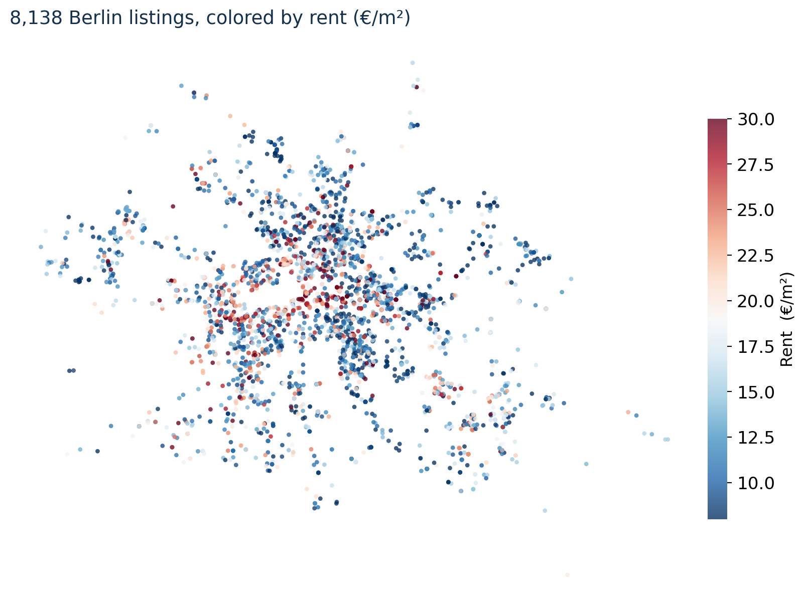
The first modeling decision was what to throw away. 41.5% of the raw listings were Tauschwohnungen — apartment swaps offered at deliberately below-market rent (median €10.37/m² versus €19.00/m² for regular listings). Their price is set by rent control and swap dynamics, not amenities, so leaving them in would poison every estimate. Out they went, leaving ~4,800 regular listings.
The design: matching, with confounders you couldn’t see before
The tool is propensity-score matching: for each apartment with a balcony, find an apartment without one that looks just like it across the confounders, compare their rents, and average those gaps. Simple in spirit; the magic is entirely in how rich the “looks just like it” can be made.
This model matches on 27 confounders, including two whole categories that a hedonic regression from a decade ago simply could not see:
- Structural — size, rooms, building era, floor, condition.
- Spatial — distance to the centre, to the U-Bahn, parks and water; counts of food/cafés/shops within 500–1000 m; and Sentinel-2 satellite indices for vegetation, water, and built-up density.
- Visual, read from the listing photos by an AI —
renovation_level,interior_quality,brightness, andbuilding_condition, extracted by a Gemini vision model.
That last group is the key that unlocks the paradox. A balcony correlates with older, less-renovated buildings — so unless you can actually measure renovation and interior quality, you can’t peel the balcony’s effect apart from the building’s. AI-extracted image features finally let you hold “how nice and renovated does this place look” constant while you vary the balcony alone.
The paradox, resolved
With the full confounder set, balance is excellent (all 30 covariates have a standardized mean difference below 0.1 on the matched balcony sample), and the balcony’s effect flips sign:
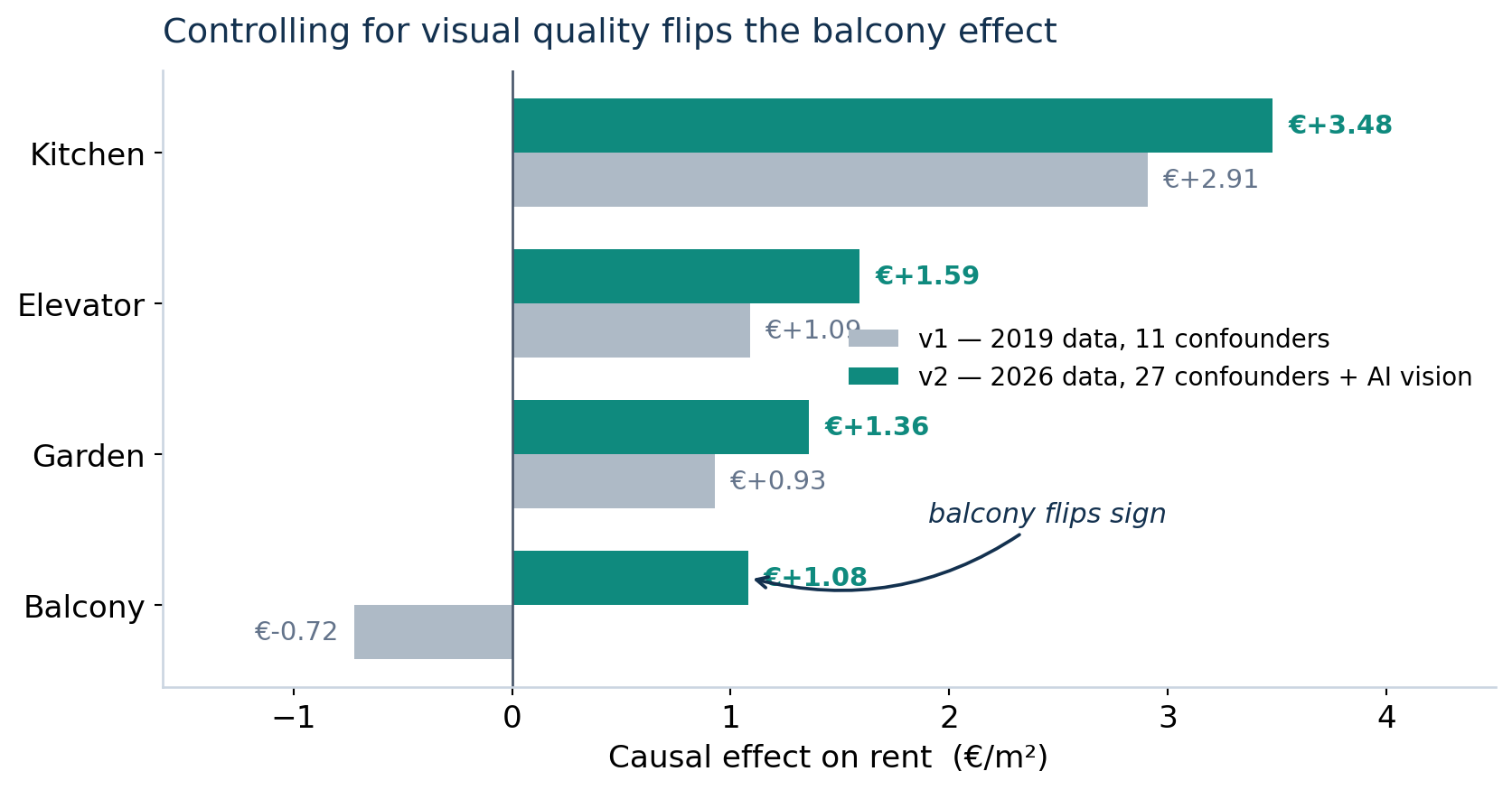
The earlier version of this analysis (older data, no image or spatial controls) faithfully reproduced the paradox: a negative balcony effect of −€0.72/m². Adding the renovation and interior-quality confounders does exactly what the theory promises. Once you stop letting “old and shabby” hide inside “has a balcony,” the balcony’s true premium surfaces: +€1.08/m², with a 95% confidence interval (€0.21–€1.97) comfortably above zero. For a 75 m² apartment that’s about +€80/month that the naive number was throwing in the bin.
Kitchen comes out as the single largest fitted premium at +€3.48/m², and it’s heterogeneous across building eras — strongest in older and mid-century stock, near zero in post-2015 new-builds where a modern kitchen is simply assumed.
New premiums you couldn’t measure before
Here’s the part I find most fun. Because the confounders come from photos, the treatments can too. Beyond the classic four amenities, I estimated causal effects for features that only a vision model can reliably tag across thousands of listings:
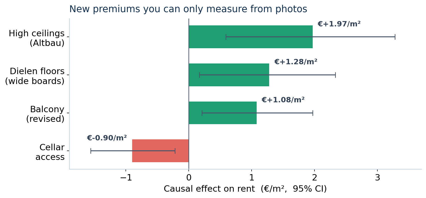
High ceilings (+€1.97/m²) and original Dielen plank floors (+€1.28/m²) — the signatures of desirable Berlin Altbau — carry real, identifiable premiums once you can see them at scale. The cellar’s negative sign is almost certainly residual confounding with older peripheral buildings (a healthy reminder that not every coefficient is a clean causal effect). As far as I can tell, using AI-extracted image features as the treatment in a hedonic matching design is genuinely novel: the photos become both the controls and the variables of interest.
Why it matters
Two takeaways, one for the method and one for the money.
For the method: the balcony paradox is a clean, visceral demonstration that better confounders change conclusions — not by a rounding error, but by flipping a sign. Multimodal data (satellite + vision) isn’t a garnish here; it’s the thing that makes the un-confounding possible at all. The missing variable was always “how renovated is this apartment,” and for the first time it’s measurable across an entire market.
For the money: to a rent-optimization product, the gap between “balconies cost you money” and “a balcony adds ~€80/month” is the gap between bad advice and good advice. When the output is a recommendation a landlord will act on, you want causal estimates — not raw correlations, and not even a black-box model’s feature importances.
The naive number wasn’t wrong because the data was dirty. It was wrong because a balcony rarely travels alone.